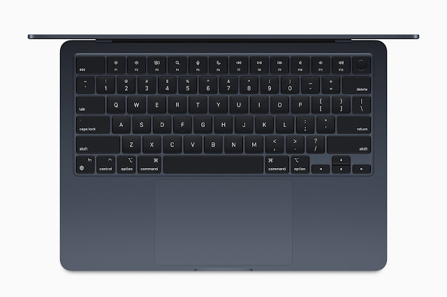
So, the other day, I was watching Apple’s 2022 WWDC Keynote, something that’s been a bit of a tradition for me since my days at the Cupertino giant. I may no longer work for the Church of St. Jobs, but something about the presentation of the keynotes is just polished to a degree other companies can’t seem to match. Besides, it’s not as if I have to support that stuff anymore! It was the presentation of the company’s new MacBook Air that I noticed something off. The colours on offer were all far more muted than previous leaks had suggested. The “Midnight” option was the most intense colour option available. Anything else was just a variation of grey, and that includes the vaunted “Starlight” that so many people have been gushing about. Don’t get me wrong, I still want one and I’m checking the asking prices for kidneys on the black market as I’m writing this.
 |
| Even Midnight Blue, the most intense tone available for the new MacBook Air, isn't really all that vibrant. |
However, it got me thinking. When’s the last time I saw a really brightly coloured device in the wild, especially a notebook? Honestly, it’s been a while. Now granted, Apple in particular still has a few bright colour options available in their line-up, not least the Product:RED editions of the iPhone that I’ve been using since the iPhone XR, but even there, the colours have shifted more and more towards pastel tones in recent product generations. The same seems to be true for most manufacturers of Android devices, in particular Samsung. Even the lifestyle-oriented Samsung Galaxy Z Flip 3, a device that I very much want, is only available in rather muted or pastel colours. And don’t even get me started on accessories like laptop bags or backpacks. You may get lucky with backpacks, but messenger bags, at least those that you can get here in Europe? Forget it!
 |
| Not so long ago, bright colours like red were seemingly everywhere, as demonstrated by my laptop bag over on the left. This was in 2012, when I emigrated to Ireland. |
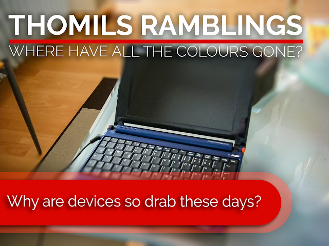
When did this change happen? I remember brightly coloured devices and bags especially being pretty much everywhere in the early 2010s and even towards the end of the decade. I still remember having a Samsonite Messenger bag with a bright red cover. My old netbook of course sported that deep navy blue, whilst other netbooks were available in a whole rainbow of intense colours, from white to blue to pink and even to neon green in some later Acer models. Microsoft was no shrinking violet in those days either, with Windows 8 being a rainbow of colours, Windows Phone operating almost exclusively with primary colours, whilst the corresponding cavalcade of Nokia Lumia smartphones came. In a corresponding array of case colours.
 |
| Even more subtly-coloured devices like my Acer Aspire One used to be a lot more vibrant than most of today's notebooks. |
 |
| And they managed this whilst still not looking cheap or gaudy. |
 |
| Microsoft took the biscuit in this regard, with Windows Phone basically using only primary colours and the corresponding devices were equally colourful! |
All this seems to have gone away relatively quickly over the last few years. I just didn’t realise the extent of this change until recently, when I started looking around for a new laptop, and especially a new tablet bag for my iPad mini. Getting anything that isn’t either black, grey, or a dark blue or green is pretty much impossible. And it’s not just my own “house” brand Samsonite that’s like that, but almost all of them from the looks of it. Now granted, I could probably get some china import from Amazon, eBay or AliExpress if I was feeling brave but yeah, I may no longer have to wear a mask but that doesn’t mean I want to lose face! Now granted, there are some options in the backpack space, but that’s about all. The situation is similar in the tech space, as I mentioned above. This is especially true in the notebook and tablet space. Even Chromebooks, the spiritual successors of the netbooks of yore and seemingly the last bastion of bright, cheerful device design, seem to have caved into the “Fifty Shades of Grey” design paradigm and now mainly ship in different shades of depressiveness. Samsung was one of the last hold-outs with a bright red top-of-the-line Chromebook but even that seems to have since been dropped.
 |
| Chromebooks were the last vestige of the colourful devices. This Samsung Galaxy Book 2 was one of the last holdouts and even that seems to have gone now. |
 |
| Now, just like with Apples new MacBook Air, the most colourful option you can hope for is a dark blue. Honestly, it's depressing! |
Which begs the question: Why? Why this sudden and drastic shift? I get that tastes change but the near total elimination of bright colours from so many areas of life, so many product families, seems a bit extreme. As does the speed if I’m completely honest. I mean right up until the beginning of the Pandemic, brightly coloured devices still seemed to be out there. Given the long lead time for many of the components that go into such devices, the pandemic itself can’t be the only reason. Now, I get that subdued colours are apparently seen as more high quality and that bright colours can come across as gaudy if not used properly. Don’t get me wrong, I appreciate that and I know that the material that brands like Bang & Olufsen use for their devices would not lend themselves to bright colourations anyway. But not every company is Bang & Olufsen and it’s not as if bright colours haven’t been used before.
I think, and this might be a controversial take, that this change in the use of colours is more of a reflection of our collective psyche. The change in design preference pretty much coincided with the begin of that never ending train wreck known as Brexit, the rise of the likes of Boris Johnson and Donald Trump, the acceleration of the climate crisis and the constant ratcheting up of global tensions. Let’s be real for a second, humanity is not in a good place at the moment, whether economically, ecologically or from a societal point of view. Cynicism reigns supreme, optimism is frowned upon almost to the point of open hostility and anyone who dares to stand out will more likely than not be cut down by often times scathing public criticism. In such a situation, it is understandable to opt for a more muted colour palette in order to not turn yourself into a target. For ridicule, or worse.
Thing is, that is not a healthy state of mind to be in. In the long term, it will cause significant damage and possibly even exacerbate the already massive mental health crisis already engulfing so much of society. We need a more optimistic outlook on life and we need more colour in our lives!
Besides, I REALLY wanted an Edition:RED version of that MacBook Air!


Comments
Post a Comment